Similarly Opposite
As I scoured department stores the past few weeks [not forgetting to add congratulations to us all for surviving yet another holiday shopping season without a warrant for our arrest] for that “perfect gift” [whatever that even means] for my loved ones, I naturally found myself doing what I do best: fashion stalking. No, I don’t get weird or harm anyone. I just look. A lot. I silently survey fellow shoppers, I view mannequins, I look at wall decor, & colors & patterns & sidewalks, & I touch everything; clothes, hardware, curtains, blankets, jewelry…I’m basically a freak for texture. I watch for patterns, trends, habits, pretty much anything that tends to lead the pack in one general direction or another. & then…I break it. Mentally, of course. I imagine a world turned upside-down, where these trends no longer drive a major group & I conjure up ways in which I can educate my clients on how to do it differently & for their own self.
After slamming two [possibly three] Cinnamon Hazelnut Latte’s from Peets & heading home, I reviewed my findings. & I recognized a major common thread among many of the men & women I’d seen during my research: over-planning. Outfits that reeked of over-intention & matchy-ness. & I started to wonder, what is it that makes for a successful outfit?
My answer: the sweet spot. The similarly opposite place in your world that holds all things in balance.
The sweet spot is the tiny nook in your fashionista[o] world where color, individuality, comfort, pattern, intention, practicality, & flair all come together to make a beautiful outfit baby. & it exists. Without much energy exerted on your behalf. Yes, really. [That’s why I’m here].
Where do we start? The color wheel.
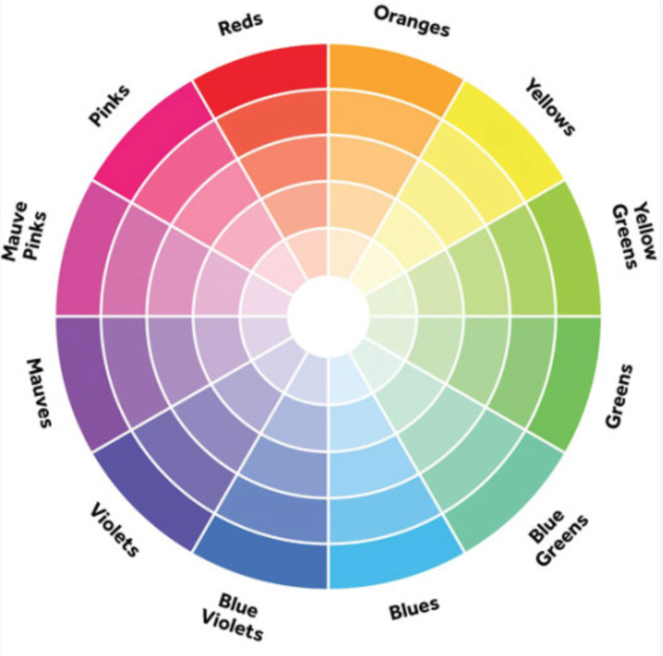
To understand fashion [or basically life itself] one must first know & understand the color wheel & what it all really means. Most importantly: color harmony [the theory of which colors are analogous with others]. Layman’s terms: find the color you’re feeling that day on the wheel above & match it with the three colors next to it. Literally. That’s color harmony. The second most important concept of the color wheel: complementary colors. Take the color you want to focus on//rock the hell out of that day & pair it with the three to four colors across from it on the color wheel. This ain’t rocket science people.
& now you’re a color expert.
But visuals make everything better…
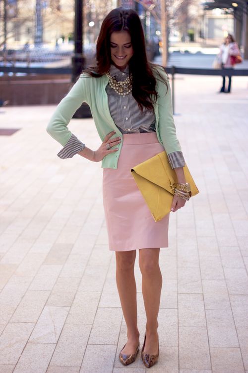
[Pink meets Mint meets Yellow meets Blue meets Leopard]
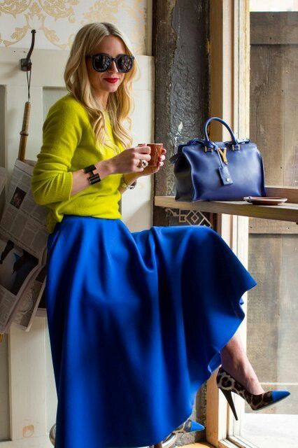
[Chartreuse meets Blue meets Leopard]
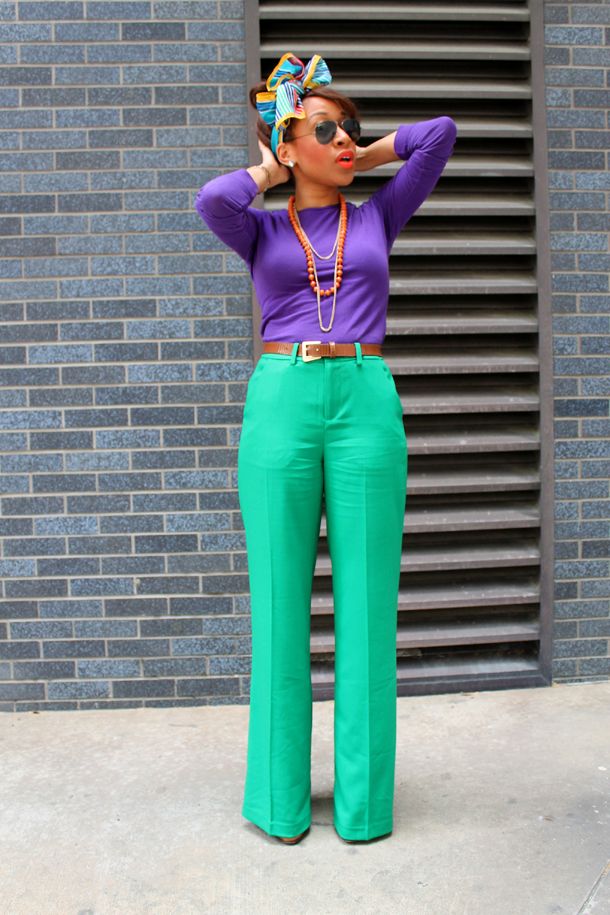
[Purple meets Green meets Brown meets Stripes meets Coral]
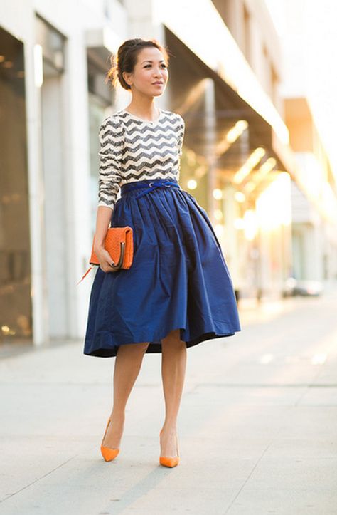
[Navy meets Orange meets Chevron]
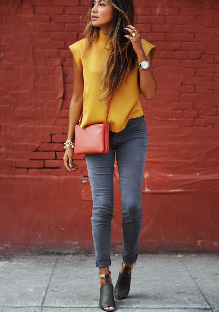
[Gold meets Grey meets Coral meets Black]
Need I say more?
Sometimes those two pieces you never imagined working side by side are dying for you to finally bring them together. & you should. For fashion’s sake & for your own creative identity.
& the next time you find yourself reaching for that black on black ensemble that you’ve been working all Winter long, try some color on for size. After all, creativity drives greatness.
Happy 2015 babes. Xx.